
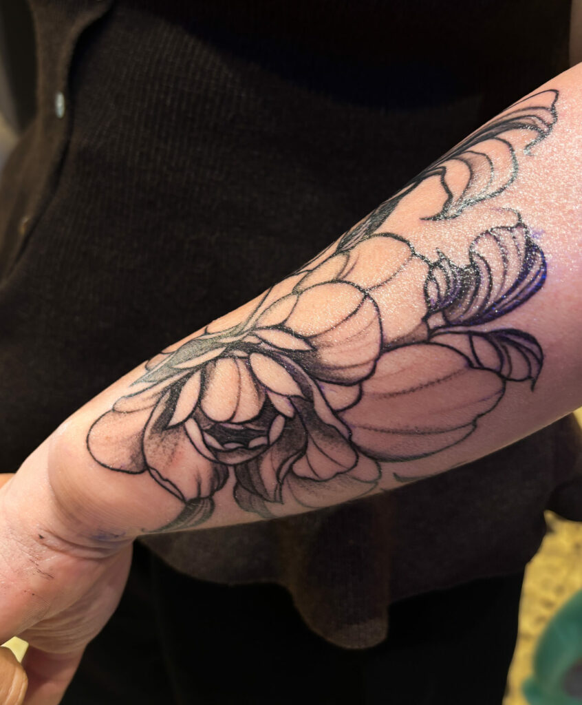
Some projects are born from a simple desire: to embellish, to adorn, to define curves without constraining them. No rigidity, no absolute black. Just colour, softness, and a composition that adapts to the woman who wears it.
This full-colour spine design was born from that.
Bisson's universe, in colour
The starting illustration is an original composition, in the spirit of'Édouard Bisson (1856–1939). What I like about him is this almost pictorial quality — his female figures seem bathed in light, enveloped in a soft material. This is not the world of printmaking. It is the world of painting. And in colour, it takes on its full meaning. His work is today available on Gallica.
Form follows function
This project does not come in a one-size-fits-all format. The treated surface, the placement, the proportions, all of that is defined according to the actual morphology. I like it when the composition dialogues with the body rather than imposing itself on it. When it follows the curves, highlighting what is already there. That is moreover what makes tattooing much more than an image: the body as a cultural surface, vibrant, unique.
The composition adapts to the woman. Never the other way round.
On pale skin, it changes everything
Colour doesn't behave the same on all skin types. On fair skin, warm shades really vibrate, soft tones stay soft, the light exists. The skin is part of the work, it's not a neutral background, it's a material in its own right. It's something that is rarely stated clearly, but it changes everything in the final result.
What this means in practice
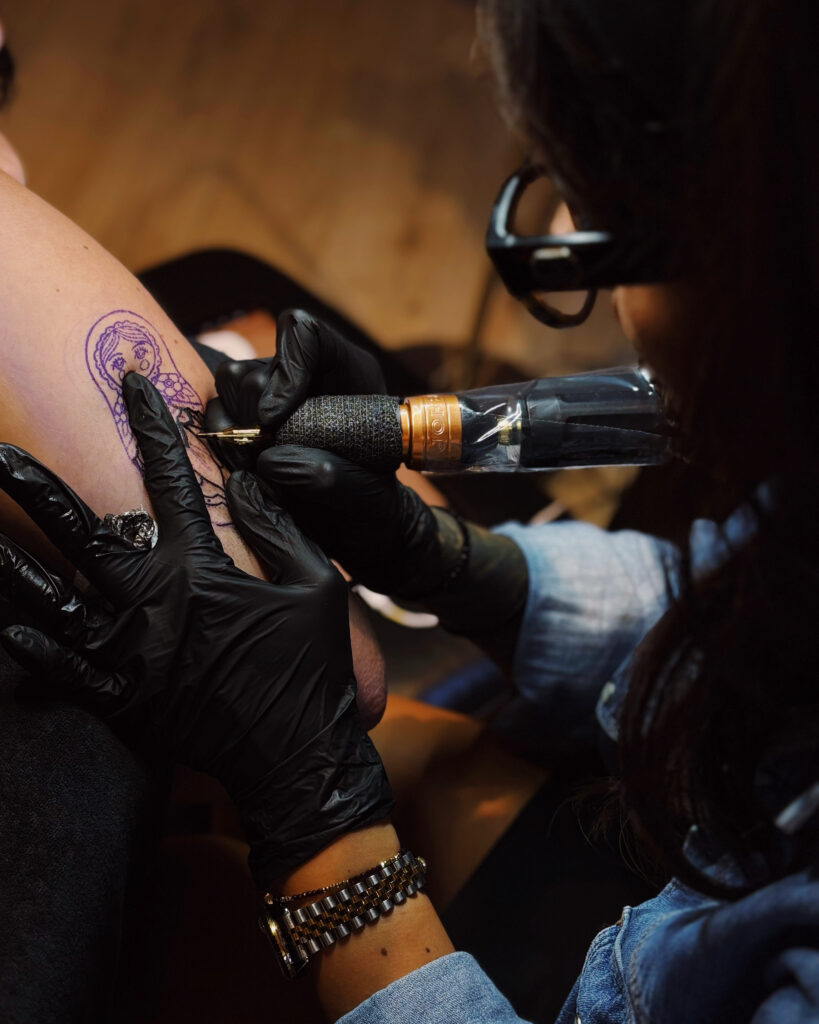
A project of this nature is carried out over several sessions. Colour takes more time than black and grey, we work in zones, we respect the healing process, and we maintain colour consistency from one session to the next. For a project of this scale, choose the right tattoo artist is a step just as important as the project itself.
This project forms part of the Art Nouveau approach developed in the studio Graphicaderme from Avignon. It is available. To discuss this, you can write to me via the contact form or directly on Instagram.
An article dedicated to this project is also available on the Graphicaderme studio website, where I discuss this composition and the approach developed around this Art Nouveau backpiece in more detail. You can find it here.
It is particularly suited to fair skin, on which soft, warm shades stand out to optimal effect. A preliminary consultation allows us to discuss together what is possible.
These are two distinct projects. Black and grey is conceived as a graphic jewel. Colour is thought of like a painting, freer, softer. One is no better than the other.
Between 4 and 8 sessions depending on the area treated and the colour complexity. A colour project takes more time than an equivalent black and grey project. And it all depends on the body shape, and how well the person tolerates the tattoo.
Yes — that is the founding principle of this project. The composition follows the curves, embraces the shapes, and enhances the silhouette. An initial discussion is essential.
Via the contact form or by message on Instagram.

0 commentaires
Be the first to leave a comment.
Comments are closed on this post.