
Hello everyone!
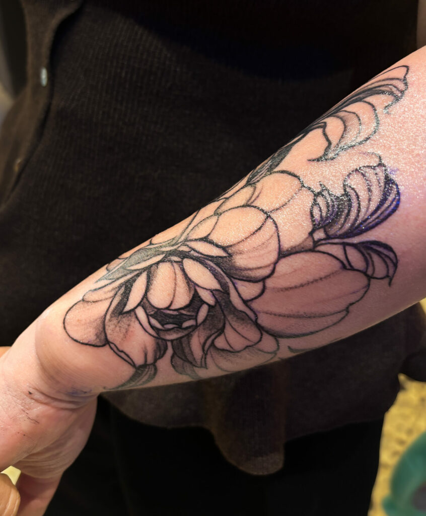
When people talk to me about my Art Nouveau tattoos, they often talk about flowers, women, curves, or Mucha. But what really interests me about this style is not just the subject matter; it’s especially the way everything is constructed.
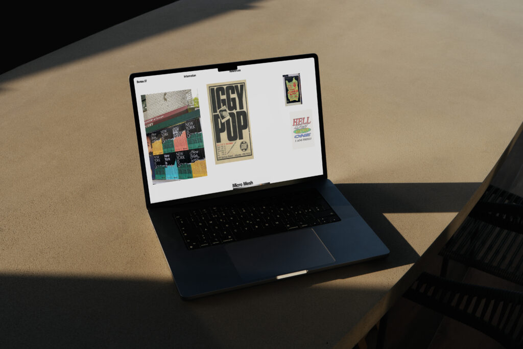
Before choosing a flower, palette, or face, I first think about the composition. Where is the main mass? Where will the eye go first? Where do we let the skin breathe? It’s exactly the same in graphic design or web design: if the structure doesn’t hold, you can add all the beautiful details you want; it will never really work.


I always start with the structure
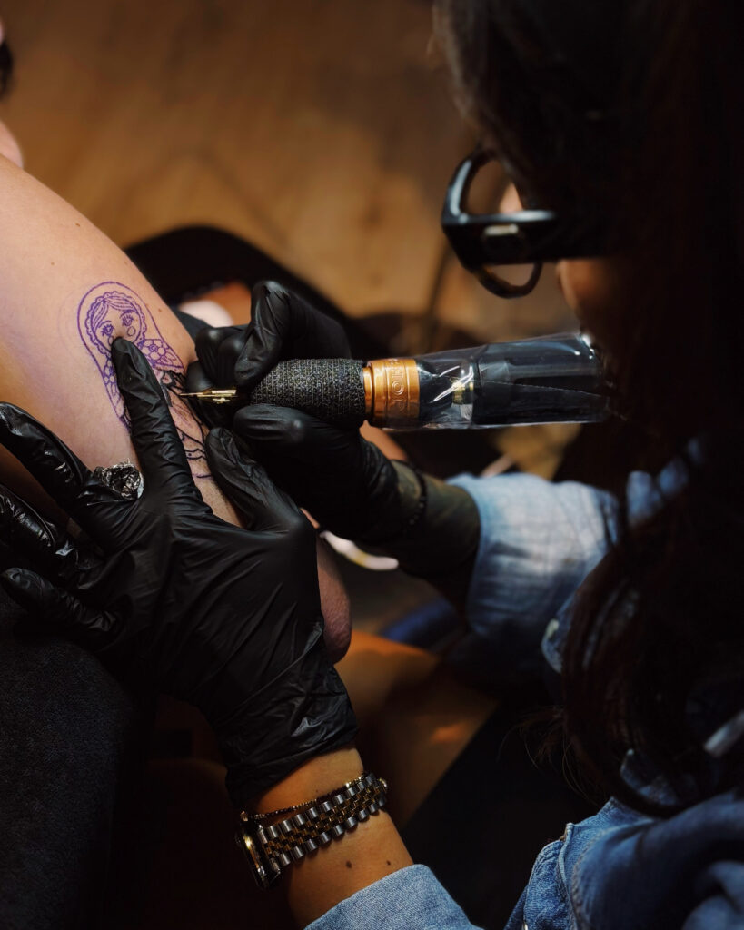
On a large project, I first look for the overall line. The body is not a piece of paper: a limb moves, a back moves, a hip changes completely depending on the position. A composition should accompany these volumes rather than simply rest on them.
So I’m looking at how the drawing will be viewed from the front, from the side, in motion, and especially what will remain readable when you’re not within twenty centimeters of the tattoo.
What Art Nouveau brings me
I absolutely love Art Nouveau because everything is movement. The lines flow from one element to another; the hair becomes almost an ornament; the flowers serve to guide the eye; and the spaces count as much as the drawn areas.

I’m not trying to reproduce Art Nouveau as a historical decor. What interests me is rather to use this logic to build an image that works on the body today.
That’s exactly what I did on the back of the colored peacock or on my projects inspired by Alphonse Mucha.
I prefer to remove than to add
I tend to over-simplify during construction. A first sketch can contain too many ideas, too many details or too many ornaments, and that’s okay. The real work often consists of understanding what can be removed without losing the image.
The empty space is truly part of the composition. It allows the tattoo to breathe, but it also gives it much more chances to remain legible over time.
In fact, that’s one of the things I also explain in my article on The aging of colored tattoos.
The reason finally comes quite late
I can work with a woman, a bird, flowers, or a portrait, but it’s never really the subject that determines whether the tattoo will be strong. It’s the way all these elements are organized together.
It’s probably also why tattooing and web design blend so easily in my head today. In both cases, I start with the hierarchy, proportions, spaces, and rhythm before I start dealing with the details.
And in the end, that’s exactly what I like: building an image that seems obvious once it’s finished, after spending a lot of time deciding what had to be removed, moved, or left empty.
0 commentaires
Be the first to leave a comment.