Hello everyone!
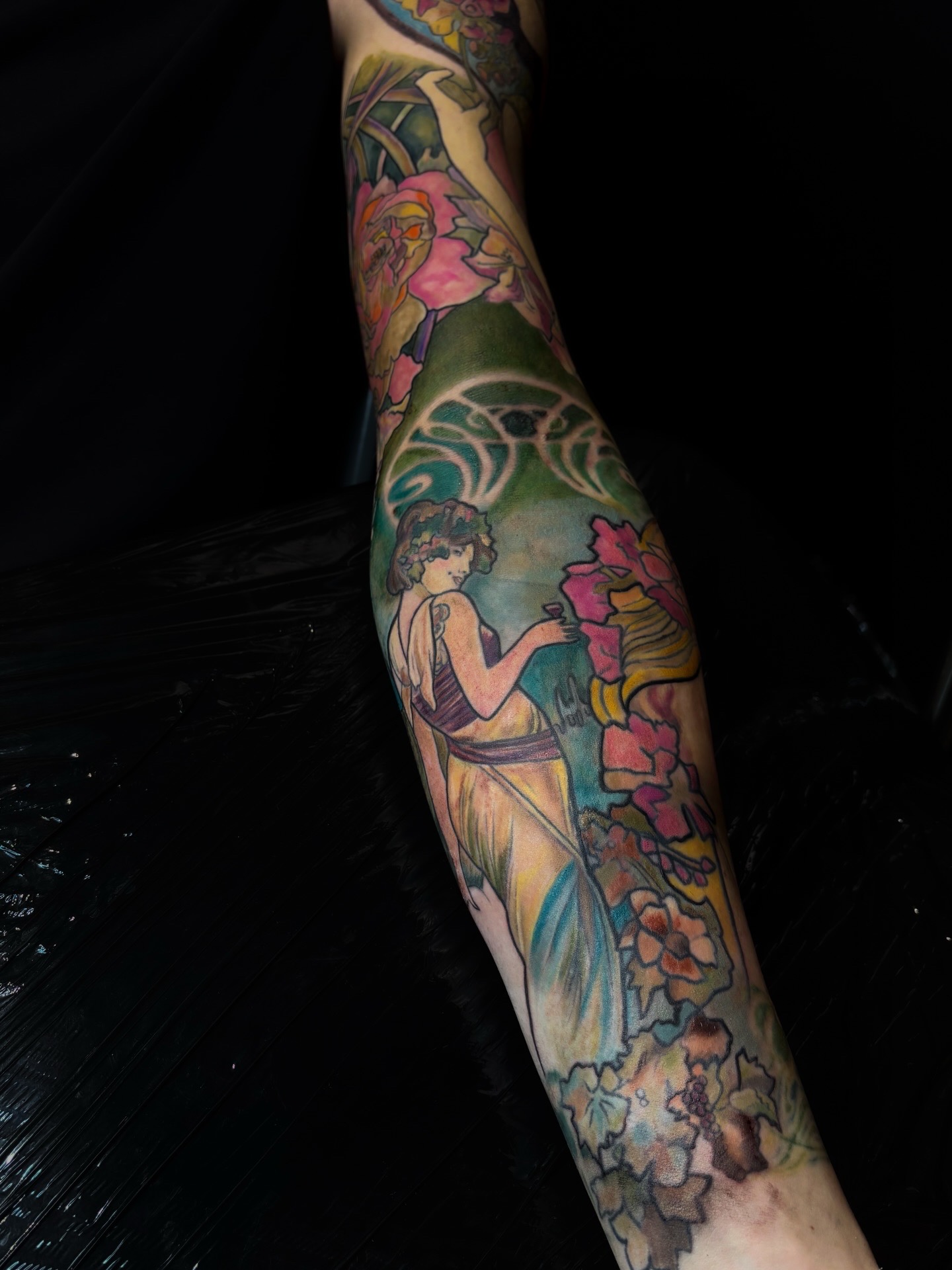
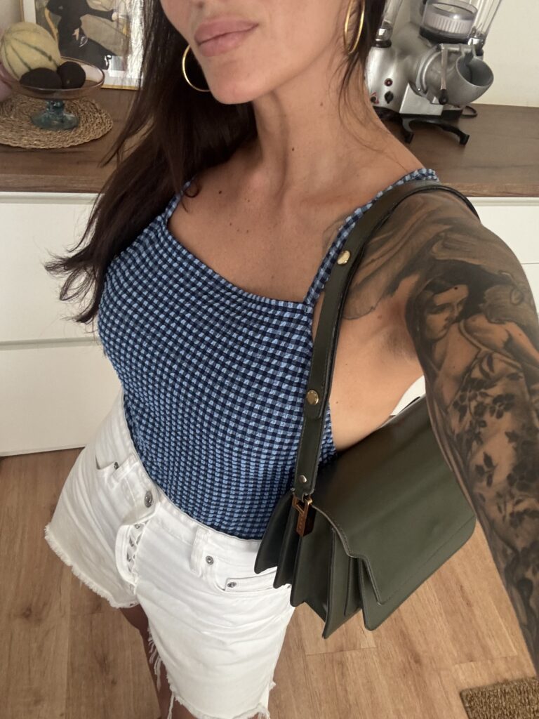
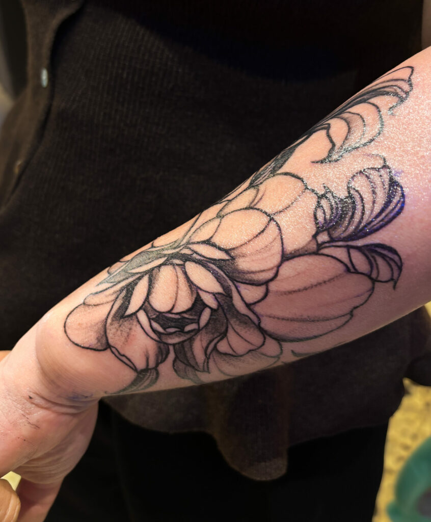
Alphonse Mucha is one of the artists I return to time and again. Even when I’m not working directly from one of his works, I find in my tattoos many of the things I love about him: the flowing lines, the very present female figures, the hair, the flowers, and the way he builds an image where almost everything seems interconnected.
And most importantly, his compositions really translate well on the body. It’s not just because “Art Nouveau is pretty as a tattoo.” There is a logical construction behind it that fits very well with the constraints of the skin.
At Mucha, nothing is really isolated
When we look at their posters, the characters do not float alone in an empty background. The hair, the clothes, the flowers, the frames and the ornaments extend the figures and allow the eye to move from one area to another.
On one arm or in the back, it’s particularly useful. You can use these lines to support a muscle, contour an articulation, or rotate a composition without the impression of juxtaposing multiple images.
This is what I worked on in particular Thomas's full sleeve inspired by Mucha.
Sweetness does not prevent an image from being strong
I also really like the fact that its universe can be very soft without becoming boring. The figures have a real presence, but the lines remain fluid and the palettes can be much more subtle than in a very saturated tattoo.
That’s something I often look for in my work: not to confuse strength with quantity. You can have a very present composition without filling every inch of skin or using the most intense color everywhere.
The palette works particularly well on large projects
The patinated greens, the more powdered pinks, the blues and warm tones found in this universe allow for quite rich palettes while maintaining a coherent feel.
With a full-length sleeve, it’s interesting because you can take some colors from different places and create a real thread that connects the pieces that were made at different times.
Obviously, a palette also needs to be adapted to the skin and the project. I discuss this more extensively in my article on my way of using color in tattooing.
And above all, Mucha was already thinking about composition
That is probably the main reason why I return to it so often. His works are not simply a collection of beautiful elements. Everything is arranged hierarchically, the masses are balanced, and empty spaces are just as important as the details.
These are exactly the questions I ask myself when preparing a large tattoo: what do I see first? Where should the skin breathe? How does the gaze move? Does the image still work when it’s seen from two meters away?
I devoted an entire article to this way of constructing my Art Nouveau compositions, Because in the end, the motif is only part of the work.
0 commentaires
Be the first to leave a comment.