
Hello everyone!
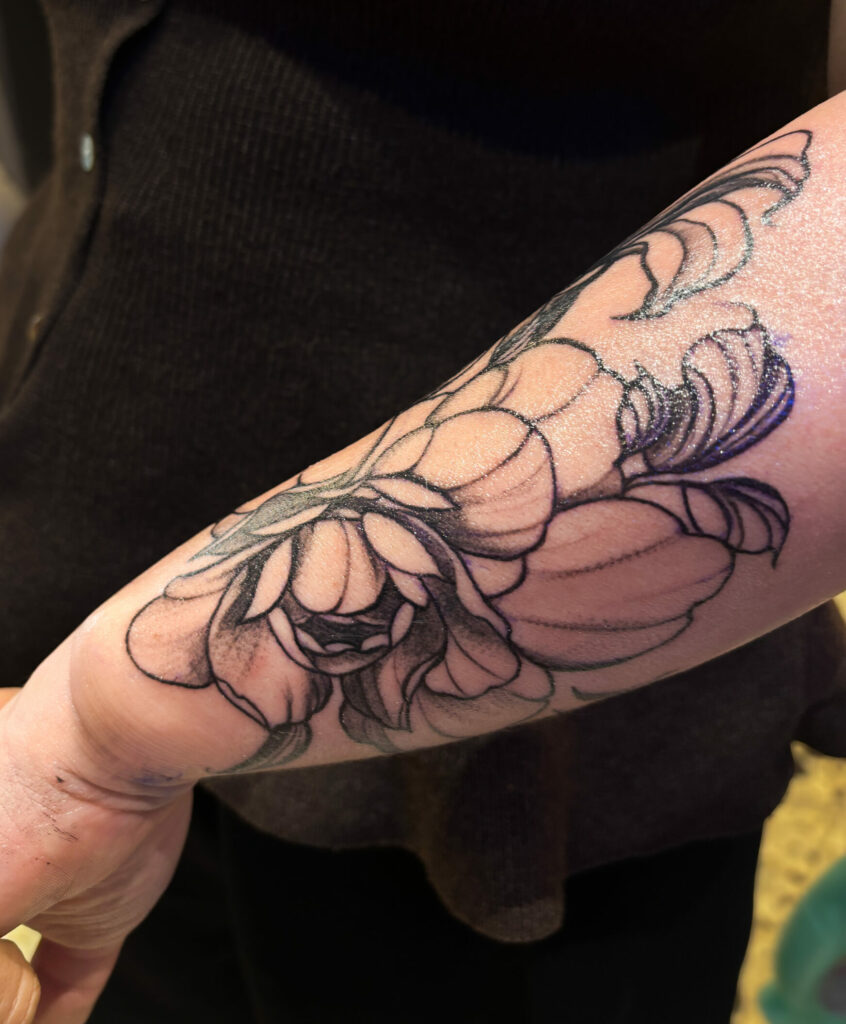
I started tattooing with a real attraction for black and grey. I still love the softness of the shades, the more discreet contrasts, and the way you can build an image with very few elements.
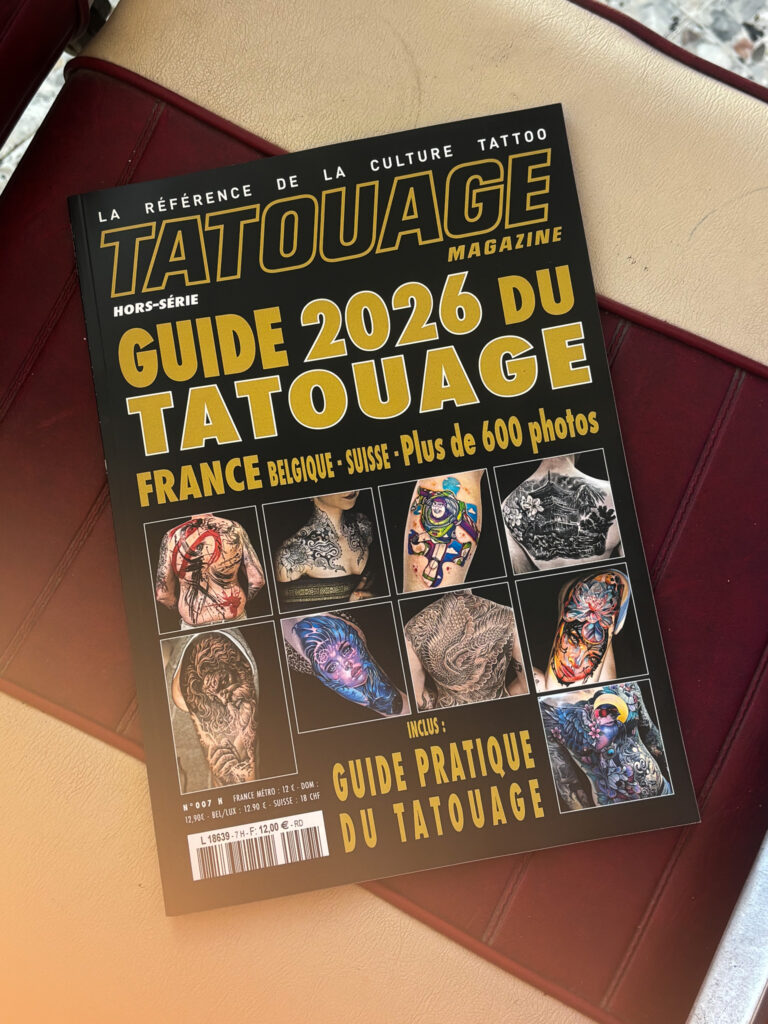
But over the years, color has taken up more and more space in my work. Initially quite timidly, then on increasingly larger projects, to full backs and full arms. Today, I believe it has become one of the parts I really prefer to explore.
Black and grey remains my base
I don’t see color as a replacement for black and gray. For me, black has taught me a lot about light, depth, contrast, and most importantly, the fact that I don’t need to fill everything in.
When a composition already works in black, it often has a solid structure. And it’s exactly this foundation that I try to maintain when I add color later on.
With color, I get closer to painting
That’s probably what I like the most. The color allows me to think more in terms of ambiance, texture, and balance between several tones. Some areas can be very present, others much softer, almost transparent.
I don’t necessarily aim to add as many colors as possible to a room. On the contrary, I like when the palette remains consistent and each color has a real reason for being there.
This is particularly true in projects inspired by Mucha or Art Nouveau, where color can very quickly take over over everything else if the composition is not solid from the outset.
Skin inevitably changes the result
A color on paper, on a screen, and on skin never react exactly the same way. The complexion, the area, the way the skin heals, and then the time all change the final result.
That’s also why I try to think about the projects for their life after the session, not just for the photo taken right after. I developed this topic in my article on The aging of colored tattoos.
The color pricing in Avignon confirmed this direction
In 2025, I received a prize for color tattooing at the Avignon Convention. Of course, that made me very happy, but especially because the color had taken up a huge amount of space in my work in previous years.
I believe that this award mainly confirmed to me that I wanted to continue in this direction, without abandoning black and grey in any way. Both of these elements serve me differently today, depending on the projects.
I really choose based on the image
There are projects that seem obvious to me in black and gray, and others that I can’t imagine in any other way than in color. I’m not trying to impose a fixed formula, because that would take away the very essence of the work.
What remains constant is the structure: a clear composition, breathing zones, and an image that works on the body even before we start talking about the palette.
If this part interests you, I have also detailed it. my way of constructing a Art Nouveau composition.




0 commentaires
Be the first to leave a comment.