After talking to you about the creation of a website for a restaurant, I wanted to go back over everything that happens before and around the site: the visual identity. Often, we think first of the logo, when in fact it represents only part of the work. In a restaurant, the identity is found on the facade, the menus, the business cards, the photographs, the social media, and even in the way the schedules or reservations are presented.
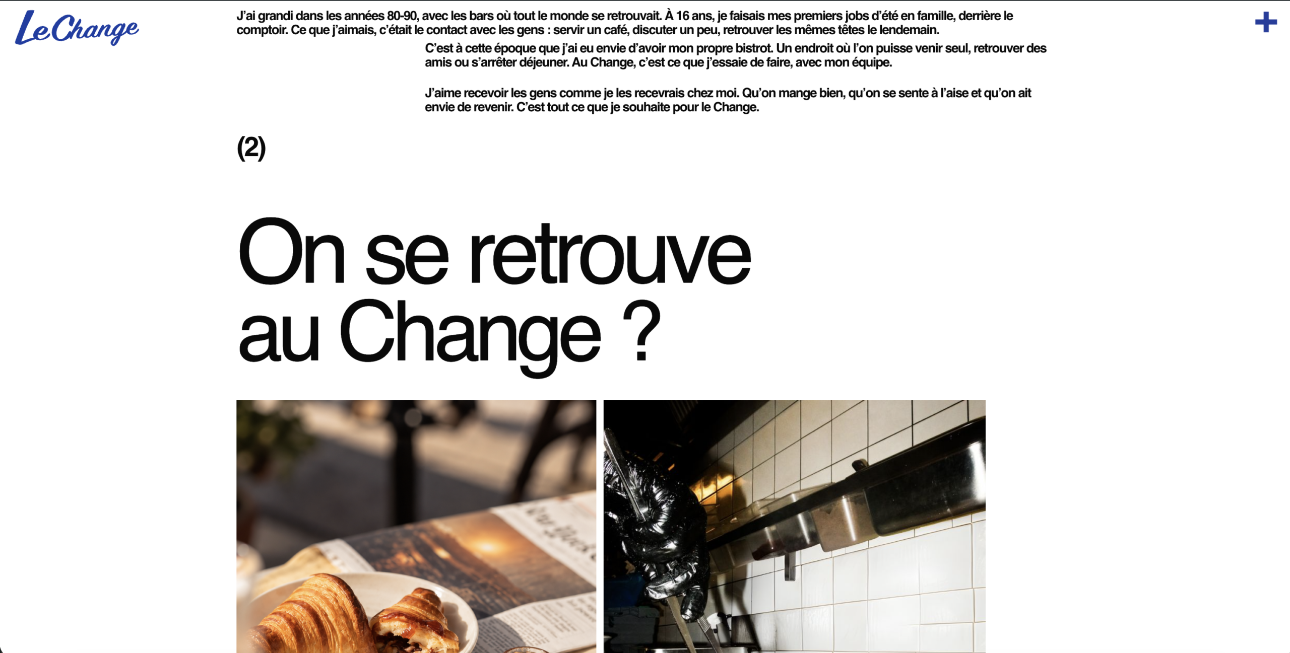
That’s exactly what I did for Le Change. The project wasn’t about drawing a logo and then placing it everywhere in the same way. I took the entire image of the café so that the coffee could be recognized on all platforms without losing the elements that made it distinctive. The place already existed, and so did the habits. So I had to build around that reality, not invent a backdrop that would only hold up on a mockup.
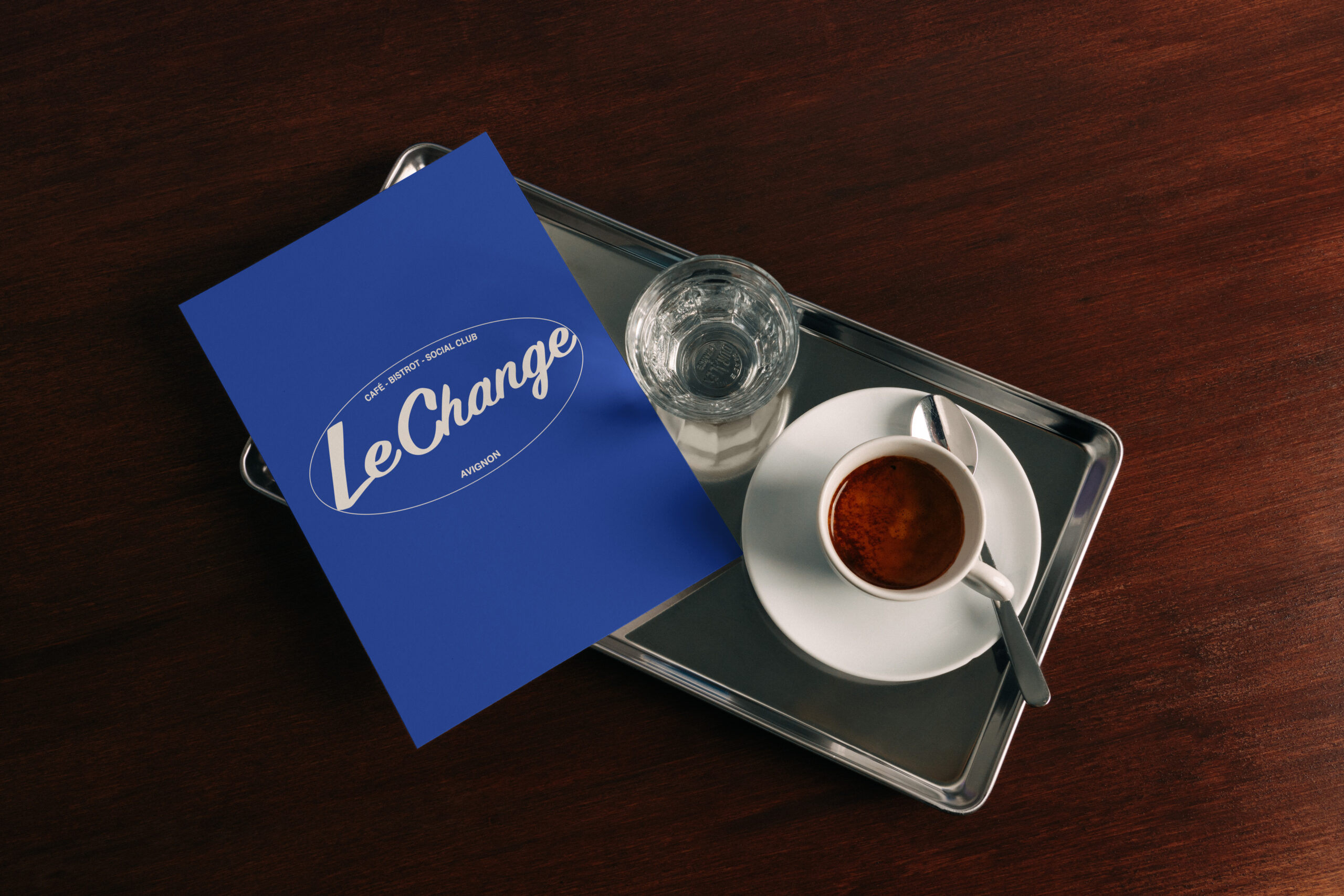
Start by looking at the place
Before choosing a color or a typography, I look at how the place works. Who comes here? At what time of the day? Do people stop for a coffee, lunch, dinner, or a drink? What elements are already familiar to the regulars? For Le Change in Avignon, it was necessary to take into account several uses without giving the impression that the café changed its personality completely depending on the time of day.
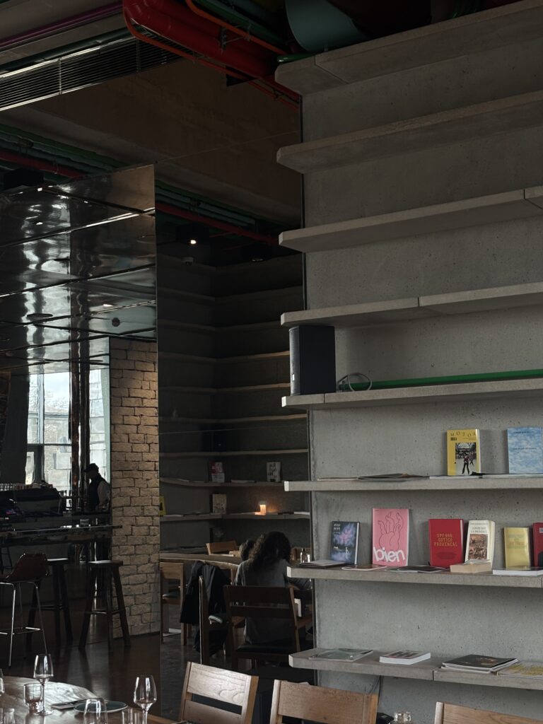
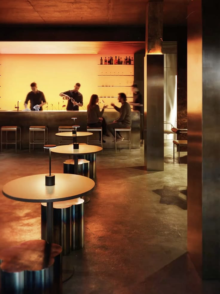
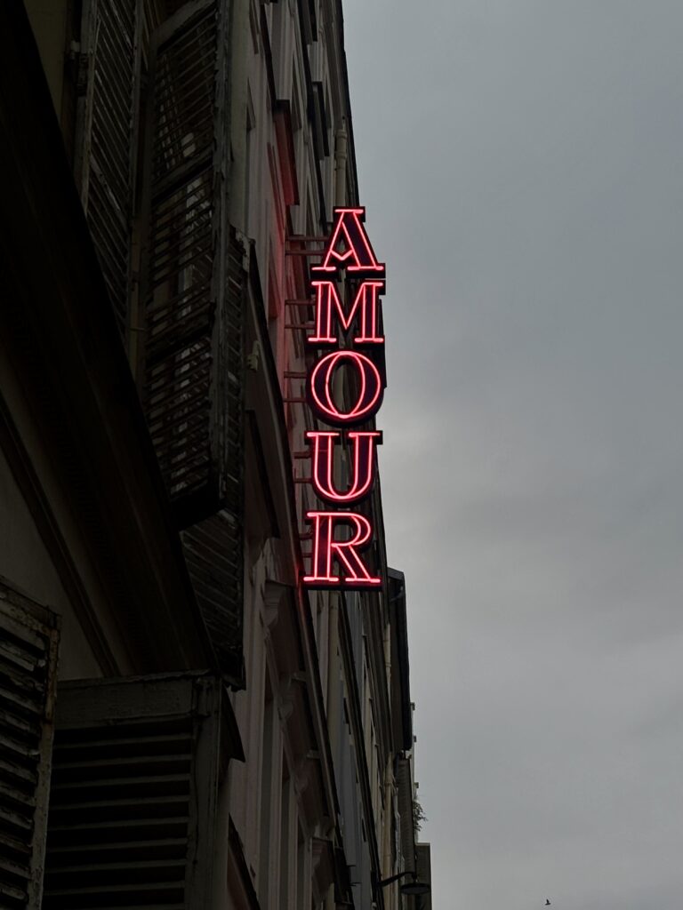
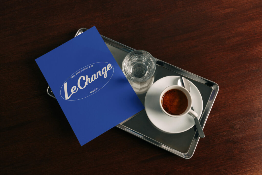
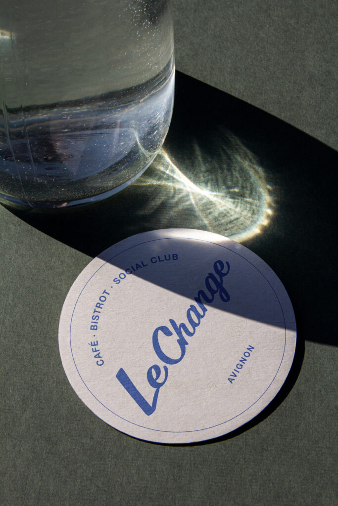
I also look at what will remain visible once the project is complete: the signage, the walls, the tables, the lighting, the tableware and the supports that customers handle. A visual identity does not live on a white background. It is found under a glass, in a showcase, on a card already used several times or on the screen of a phone in full sun. It is these very ordinary situations that allow us to know whether the graphic choices really work.
A logo must be able to be displayed on the screen
The logo must obviously be identifiable, but it must above all be able to be used in very different formats. On a sign, it must remain legible from a distance. On a business card or a menu, it should not take up all the space. On the website, it must work as well on a computer as on a mobile device. This often requires several versions, simple rules, and enough flexibility so that the team can use it without having to redo the entire composition every time.
For Le Change, blue, pink and typography have allowed them to create a very recognizable set without locking each medium into the same model. It was important that the result remain alive. The menu doesn’t exactly have the same composition as the website or a poster, but you immediately understand that they belong to the same café.
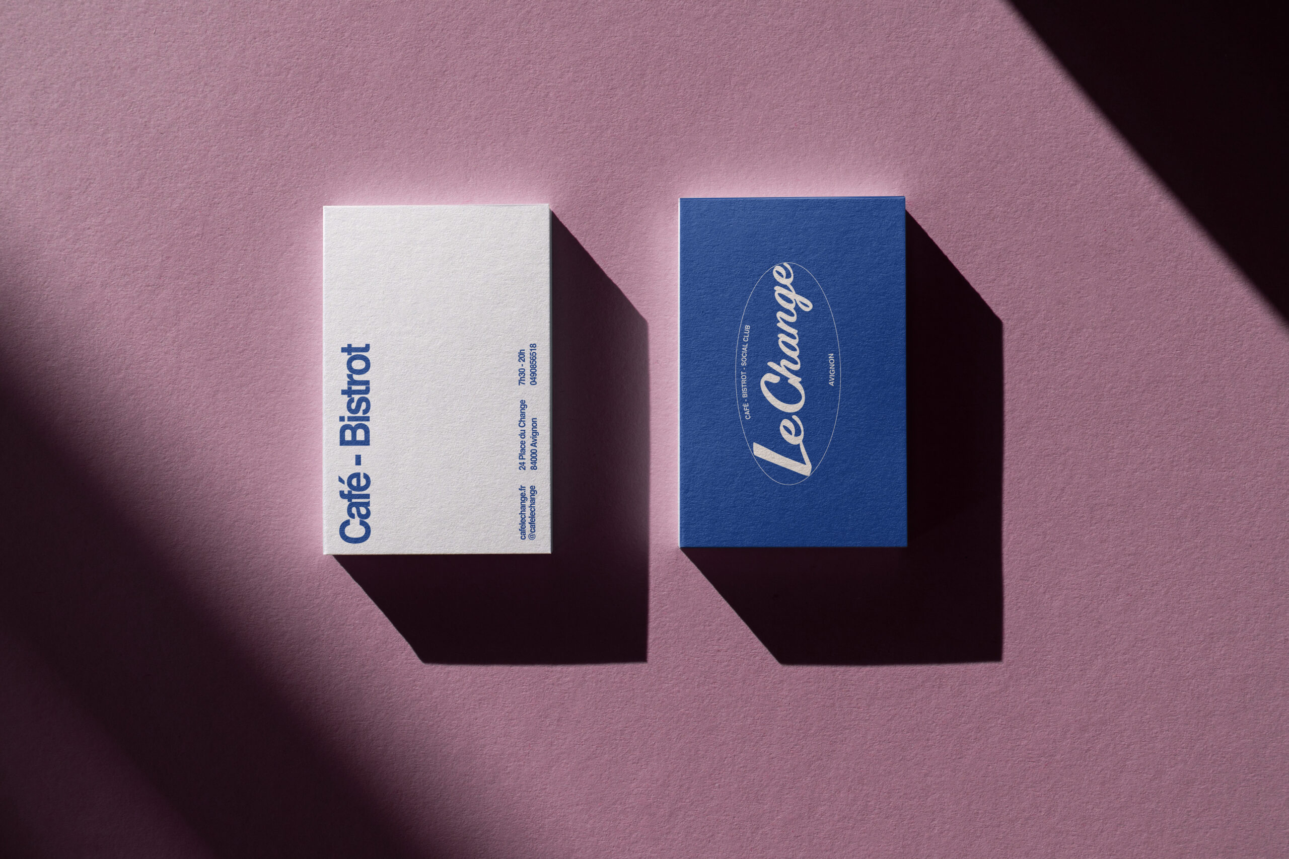
The menus are part of the decor
The menu is an object that almost all customers take into their hands. It must be pleasant to read, withstand daily use, and allow for changing dishes or prices without destroying the entire layout. It is also one of the places where visual identity becomes the most concrete. The typography, spacing, paper, and colors immediately change the way we perceive the restaurant.
I find it always strange to see a place with very elaborate decor and a menu that seems to come from another restaurant. The printed materials are not an added detail at the end. The menus, posters, signs, brochures, and business cards extend the place. They must remain consistent with each other while each serving a specific purpose. This idea of thinking of a place through all its details is also at the heart of my article on William Morris and the identity of a place beyond the logo, published in Minuit d’Orsay.
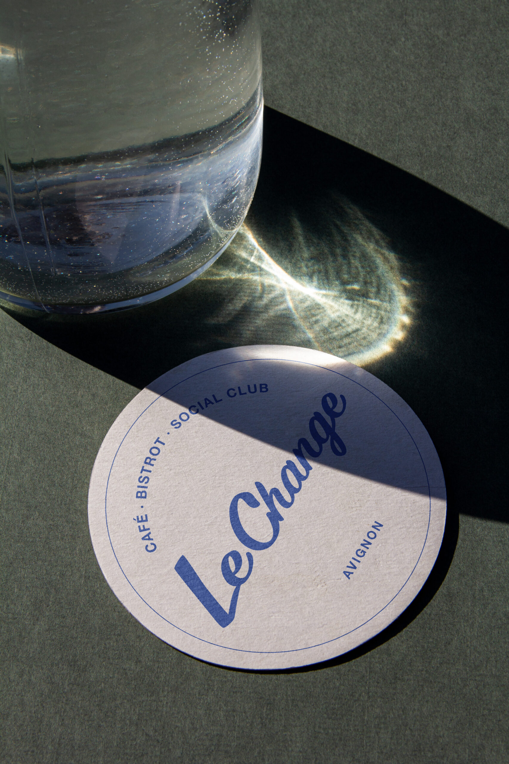
Photographs also build identity
Photographs are often treated as a separate step, when in fact they greatly influence the perception of a restaurant. While the colors, lighting, and framing change completely from one image to the next, the website and social media quickly lose their consistency. Therefore, I prefer to think about the images at the same time as the rest of the project, looking at what needs to be shown and how they will be used.
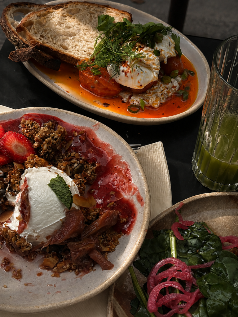
It’s not just about photographing the plates. The place, the tables, the materials, the people and the small details all tell the story. For Le Change, I created the photographs for the website and the various media to maintain the same look. This then allows the information to be fed into Google, social media or a poster without having to start from scratch with each publication.
From the venue to the website
When the logo, colors, typography, and photographs are in place, the site becomes much more than just a showcase added to the project. It retains the same features while adapting them for another use: finding schedules, consulting the map, discovering the location, or booking a table from your phone. The identity must remain present, but it must never interfere with reading or slow down the journey.
I have described in more detail the redesign of Change, from recovering its Google profile to booking online, in the article dedicated to the project from A to Z. You can also find the more technical questions in my article on the pages to be included in the website of a restaurant.
An identity that can evolve
A successful visual identity doesn’t require completely redesigning the entire communication for every change in menu or event. It provides a clear enough framework to remain recognizable, but flexible enough to accommodate new formats. This is particularly important in the restaurant industry, where menus, schedules, teams, and offerings can change several times throughout the year.
You can see the entire work in the project sheet of Change on Minuit d’Orsay. I am a web designer and the founder of Minuit d’Orsay in Paris, and I accompany restaurants, hotels and independent venues with their identity, their photographs, their printed materials and their website. To present my project, you can contact me via the studio's contact form.


0 commentaires
Be the first to leave a comment.