Hello everyone!
Today, we’re going to talk about a very concrete topic: creating a website for a restaurant. I still see a lot of people who rely almost entirely on Instagram or their Google listing, with a map that’s impossible to find, different schedules depending on the platforms, and a booking button that ends up sending you to a messaging system. For a customer who just wants to find somewhere to eat that same evening, that’s already a lot of information to sort through.
When I took over the site of the Change, I had to start all over again: the identity, the photographs, the printed materials, the website, the online booking, and even the Google listing, which had been attached to the former owner for five years. This project reminded me especially that a good restaurant website doesn’t need to accumulate pages. It must quickly answer the questions people ask before coming, while giving a fair idea of the place.
What customers come to look for
The first thing to do is not to choose an animation or button color. You need to look at what customers are really looking for: the hours, the address, the menu, the prices, the type of cuisine and the ability to book. This information needs to be clearly displayed, especially on the phone. When someone visits the site in the street or between appointments, they’re not going to scroll through five pages to find out if the restaurant is open on Monday nights.
The homepage can already answer a large part of these questions, provided that you don’t cram too much into it. A brief presentation of the place, a few photographs, the essential information and visible links to the map and booking are often enough. The rest can be organized in a simple navigation. The work consists mainly of deciding what should be seen immediately and what can wait for a second page.
The card should be easy to consult
The card is probably one of the most viewed pages, yet it is also the one that regularly causes problems. A heavy PDF, photographed incorrectly, or written too small quickly becomes cumbersome on mobile devices. According to the restaurant, the card can be integrated directly into the site, offered as a properly formatted document, or both. The choice depends, in particular, on how often it changes and how the team wishes to update it.
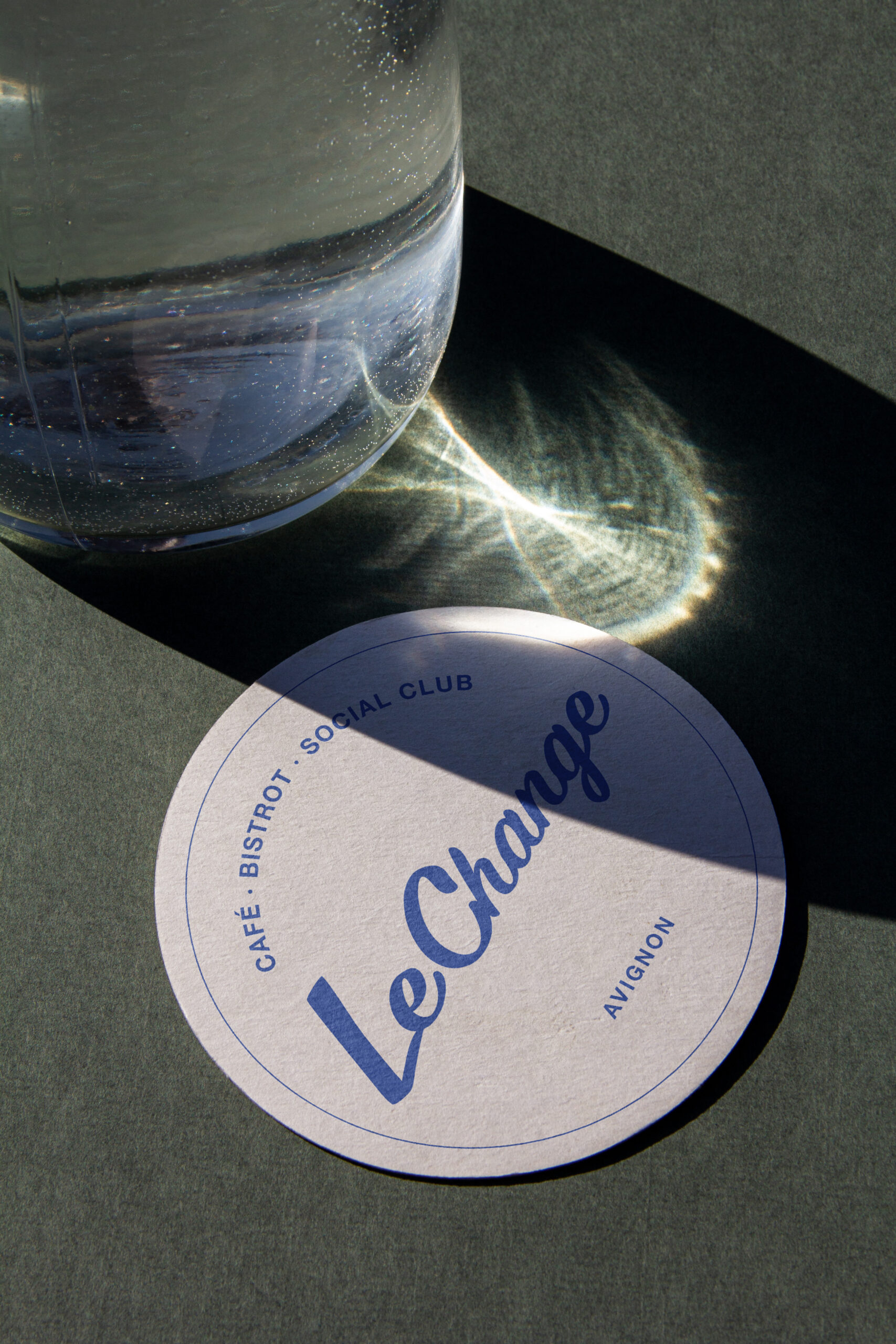
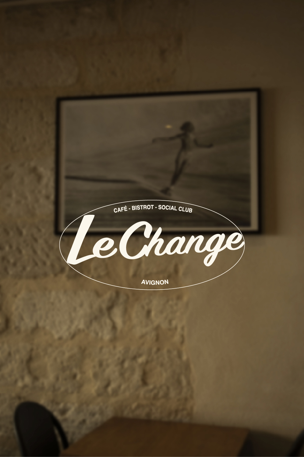
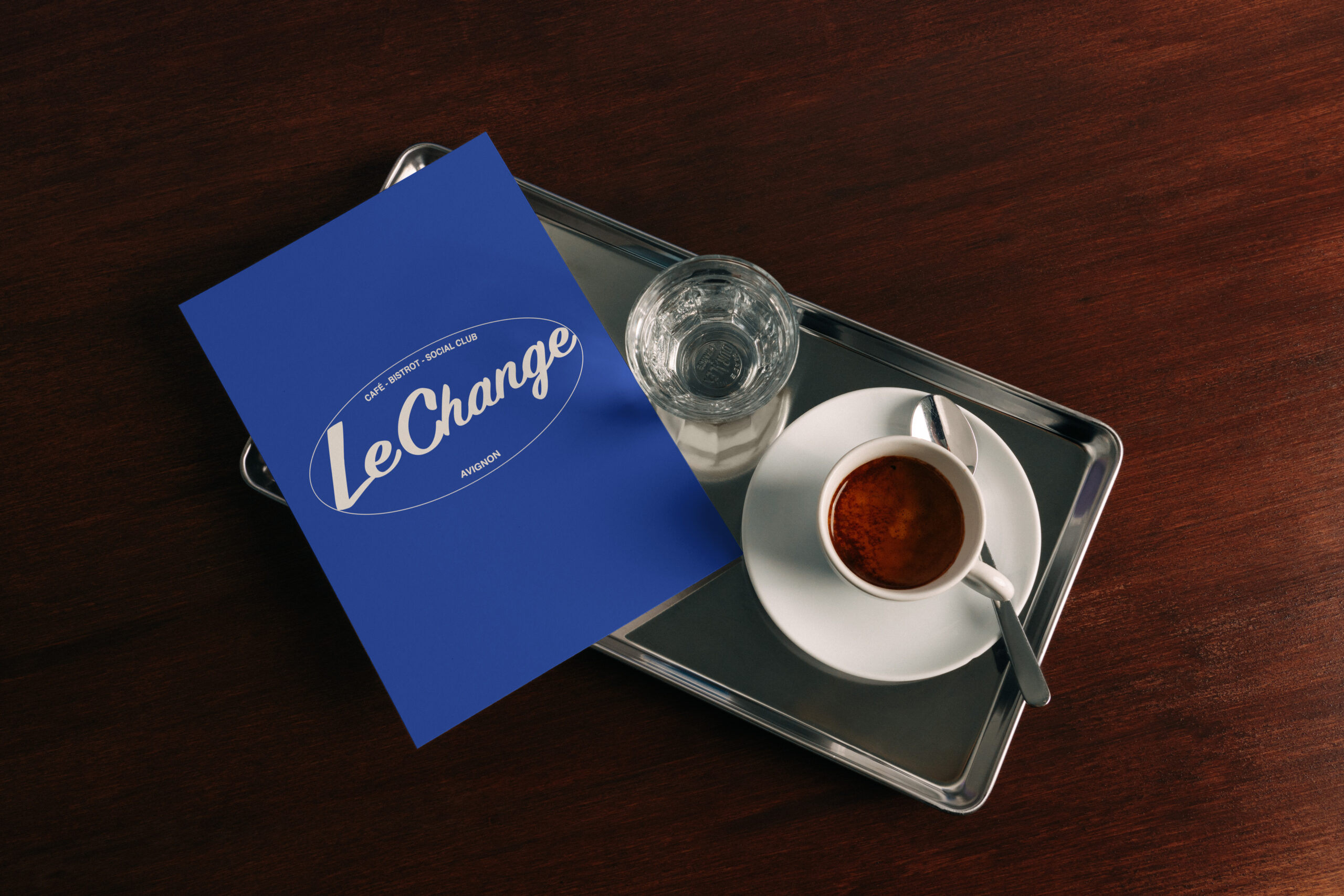
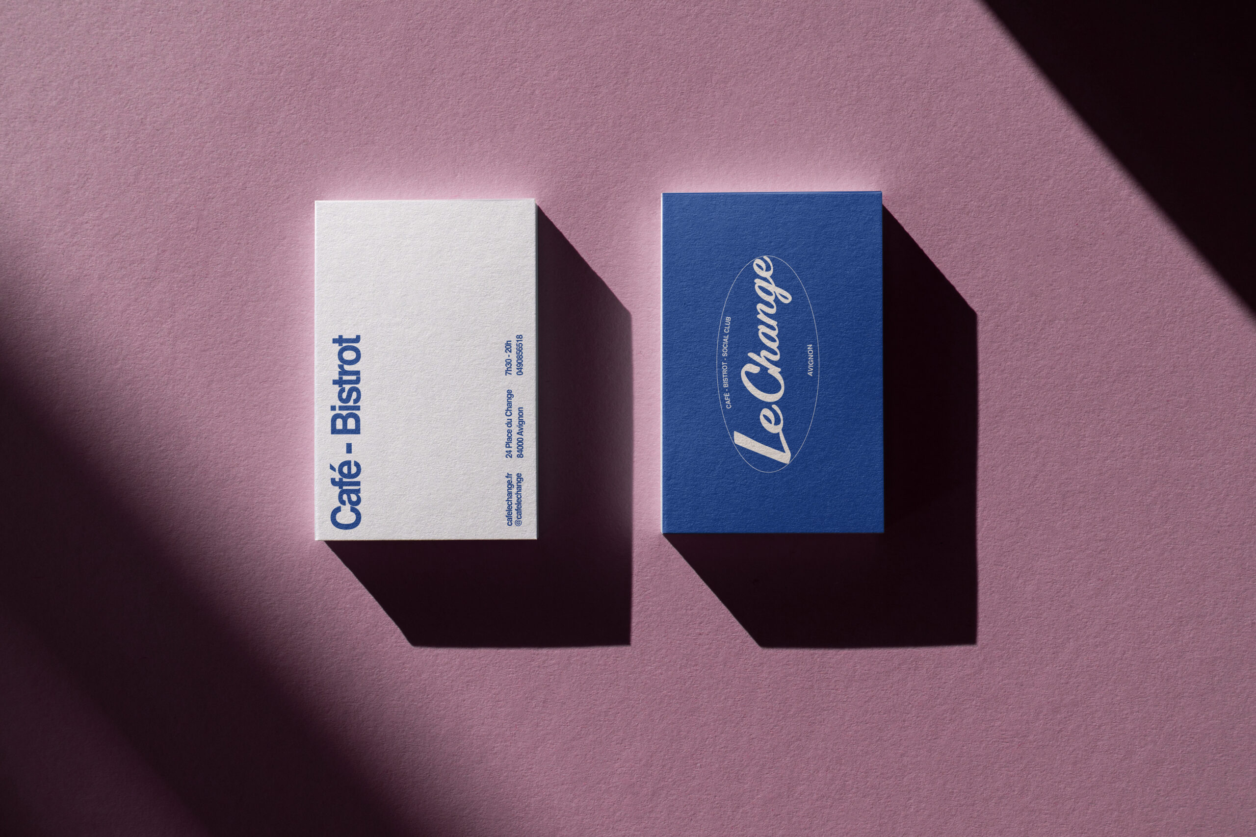
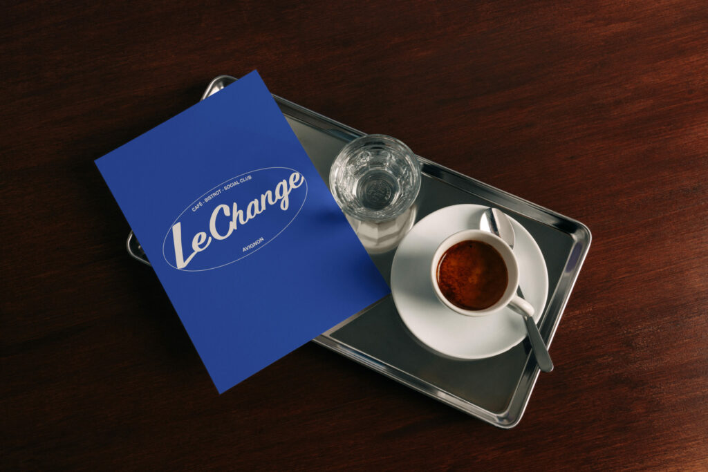
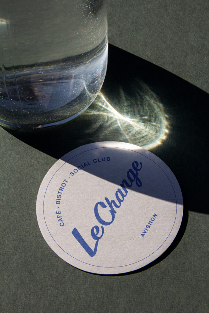
One must also think about the continuity between the site and what is found there. The menus, business cards, posters and signs are not separate elements. They are part of the same identity. For Le Change, I worked on the logo, the photographs and the printed materials at the same time as the site so that people would recognize the place before and after they entered the door.
A reservation that doesn't lose anyone along the way
The booking system depends on the operation of the restaurant. Some establishments use a dedicated platform, while others prefer to receive requests from their own website. In both cases, the button must be visible and the process must be understandable. The customer must know whether they have just booked a table or have only submitted a request awaiting confirmation. This seems obvious, but it is exactly the kind of detail that creates unnecessary calls and misunderstandings during service.
On the Change website, the booking form is integrated into the tour with useful information, the map and the café’s news. The website does not replace the team and does not seek to automate every exchange. It simply allows requests to be centralized and prevents reservations from arriving in several different messaging systems.
The photographs are not used to fill the pages.
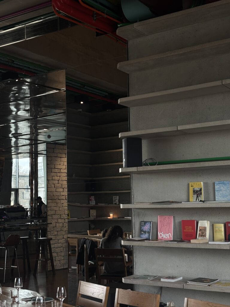
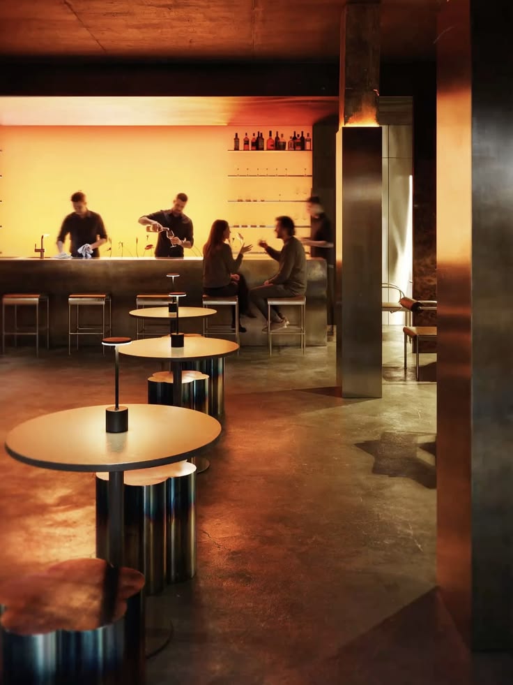
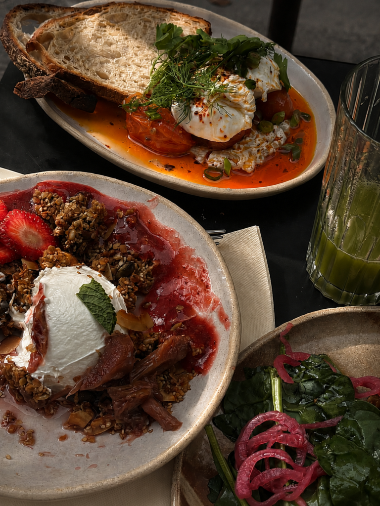
For a restaurant, the images immediately give an idea of the place: the size of the room, the lighting, the terrace, the plates, the materials and the way the tables are set up. I prefer to photograph what actually exists rather than creating an image that is very far removed from what customers will discover on site. A consistent series can then serve the site, the Google listing, social media and printed materials.
The site does not work alone
A website can be very well designed and still be difficult to find if all the other information is inconsistent. The Google listing must belong to the right owner, include the correct hours, and point to the correct address. The name, phone number, and main information must remain the same from one platform to the next. It is also necessary to provide pages that are clear enough for Google to understand the activity of the place, without repeating the same words fifteen times in each paragraph.
News can be useful when they relate to the restaurant’s real life: a new service, a changing menu, an event or a special opening. They give reasons to return to the site and allow you to work on local SEO with information that really has something to say.
Creating a set that remains simple to use
Ultimately, creating an online presence for a restaurant doesn’t just involve putting a menu and three photos online. It requires connecting the identity, the operation of the place, the habits of the team, and the questions of the customers. The site must remain pleasing to look at, but above all be usable on a daily basis and simple enough to evolve as schedules, the menu, or events change.
You can find The complete profile of the project Le Change sur Minuit by Orsay, With the site, the visual identity, the photographs and the printed materials. I am a web designer and the founder of Minuit d’Orsay in Paris. I accompany restaurants, hotels and independent venues that wish to create or renew their identity and their site without having to deal with many different parties. To discuss your project with me, you can use the studio's contact form.






0 commentaires
Be the first to leave a comment.