Hello everyone!
I’ve been meaning to write about Tate Modern for a while. I took so many photographs during my visit and, looking back through them, realised it deserved a post of its own.
And above all it's free, we love that!
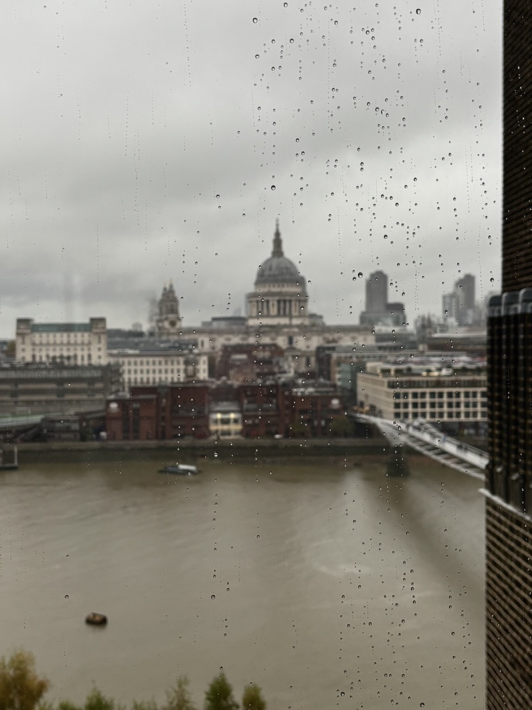
Tate Modern sits on Bankside, right beside the Thames. It’s enormous, so don’t feel you have to see everything in one visit. I took my time and stopped for the works that genuinely caught my eye.
Cildo Meireles's Babel
I loved this installation! Babel, made by Cildo Meireles in 2001, is an enormous tower built from hundreds of old radios, all switched on and quietly playing different stations.
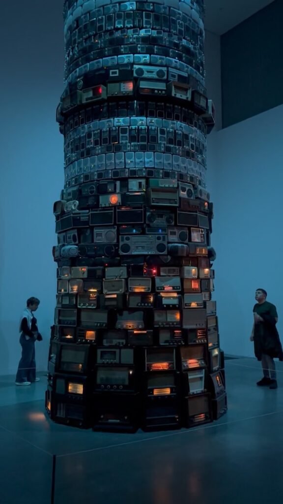
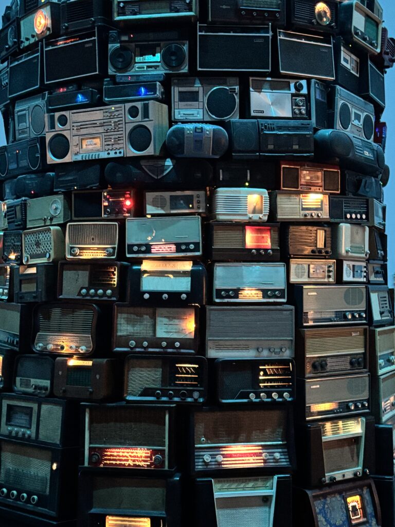
At first, I was absorbed by the colours, dials and shapes of all those radios stacked together. Then you notice the voices and music bleeding into one another. You try to listen, but nothing is quite intelligible. The work is about how difficult communication becomes when everybody speaks at once. It was one of the pieces that stayed with me most, and the atmosphere in the room was brilliant.
Andy Warhol's Marilyn Diptych
I’d seen this work in photographs countless times, but in person it is something else. On one side, Marilyn’s portraits are drenched in colour; on the other, they turn black and white and gradually disappear.
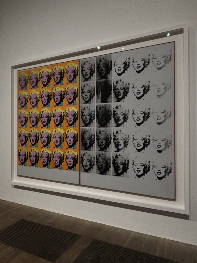
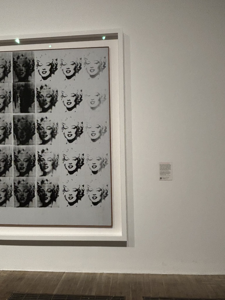
The image is so familiar that you almost forget to really look at it. In front of the work, the repetition, printing imperfections and contrast between both halves become much more obvious. It’s beautiful.
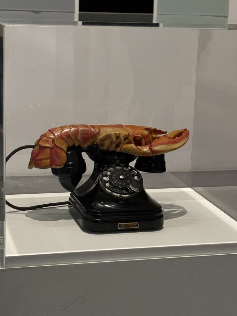
Salvador Dalí's Lobster Telephone
Impossible not to photograph the Lobster telephone by Salvador Dalí. It is exactly what the name promises: a lobster where the receiver of a telephone should be. Completely absurd, very funny and somehow visually perfect. I love work that remains immediately enjoyable even when you don’t know its entire backstory.
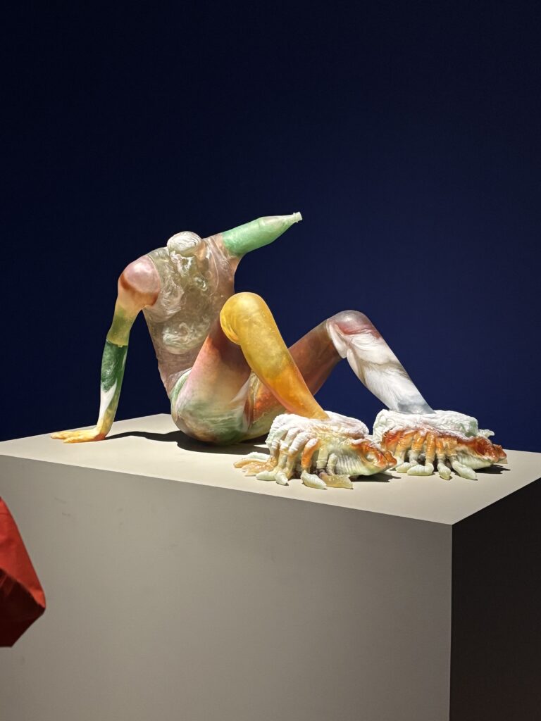
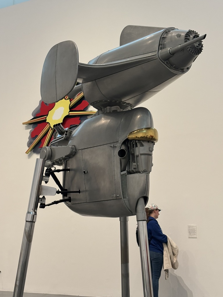
I loved this translucent sculpture too. The colour seems suspended inside the material and shifts as you move around it. Its feet are enormous compared with the rest of the body — naturally, that was the first thing I noticed.
Wyndham Lewis and the BLAST magazine
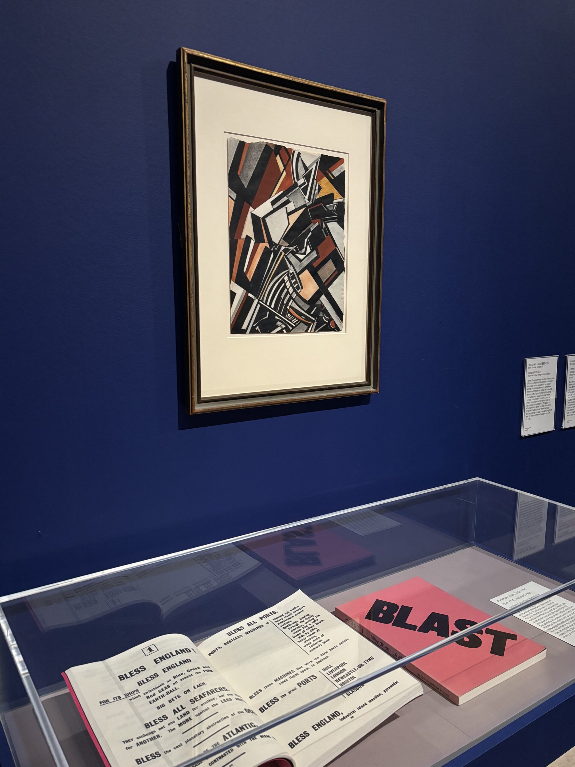
This part dedicated to Wyndham Lewis and the magazine BLAST completely won me over. I looked at the paintings, but also the covers, the huge black lettering, the acid pink and the way every page had been composed.
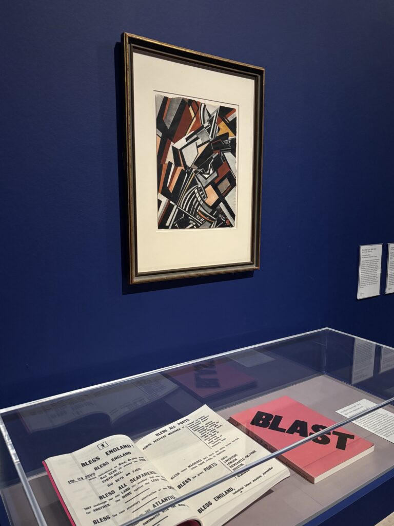
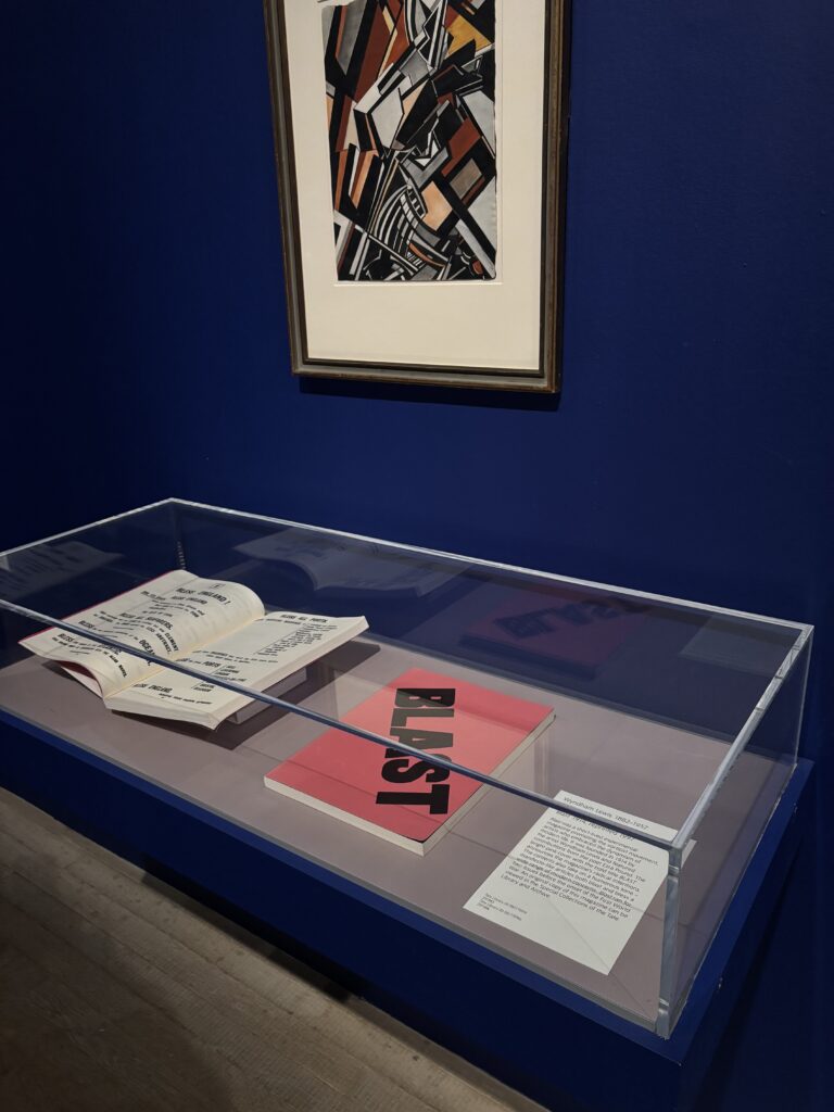
I spent almost as long looking through the pages of BLAST as I did at the paintings. The oversized black type, vivid pink, and the way the text takes over the page still feel strikingly current more than a century later. It also brought to mind the work of Fraser Muggeridge, another figure in London graphic design whose work I really admire.
The Guerrilla Girls
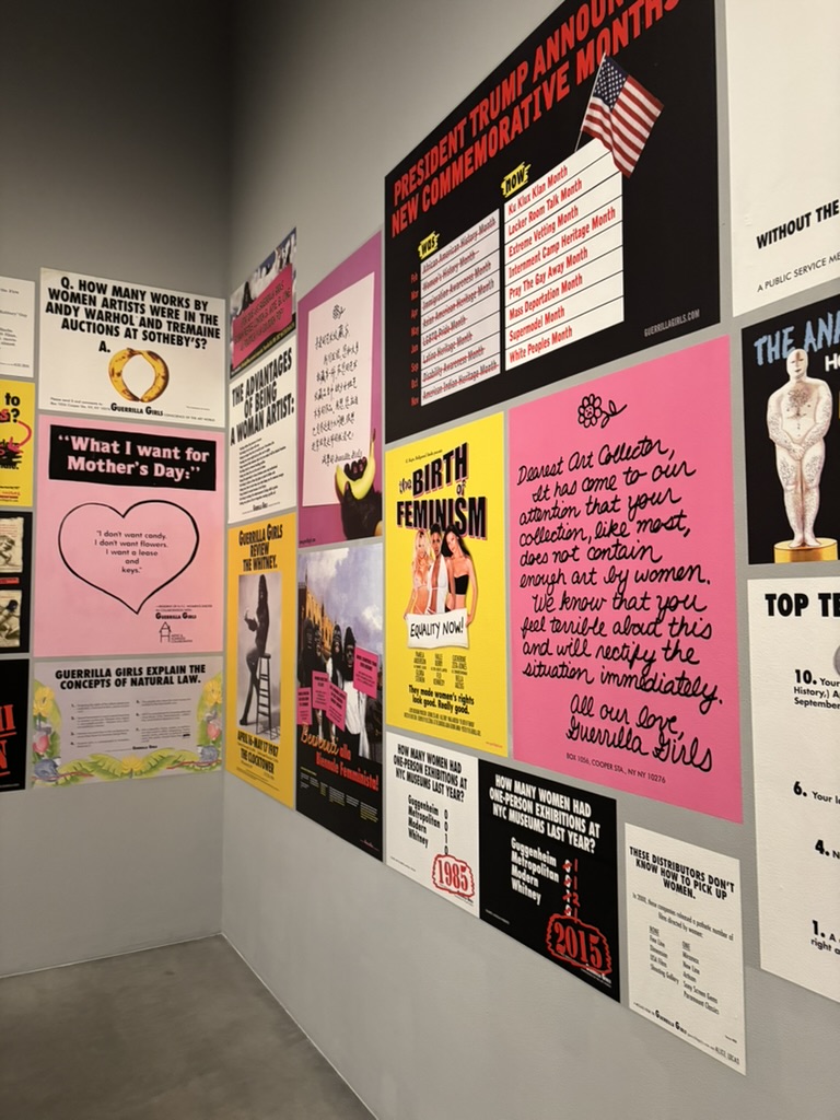
I was delighted to see the Guerrilla Girls’ posters too. Since the 1980s, the feminist collective has used hard figures and sharp humour to call out the lack of women artists in museums and the art market.
Their posters do not mince their words: pink, yellow, black, huge headlines and questions institutions can’t easily dodge. You understand the point at once, but still want to get closer and read every one.
A few more works I photographed
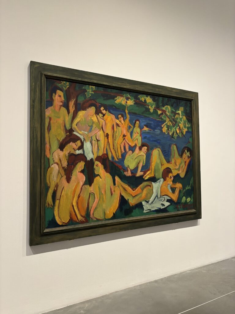
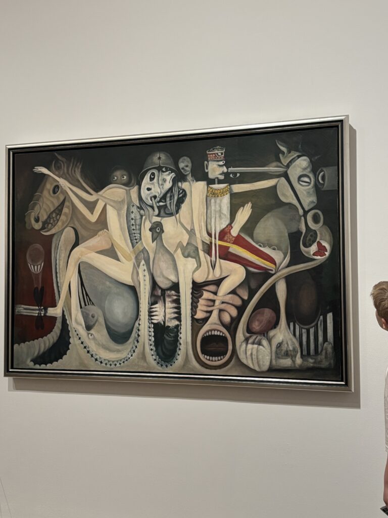
My other photographs include Ernst Ludwig Kirchner’s bathers and a huge painting filled with strange figures. I didn’t know every work before I walked in, and that is exactly what I enjoy about Tate Modern: you arrive for a famous artist and discover something completely unexpected in the next room.
Practical information
- Address: Bankside, London SE1 9TG.
- Starter the permanent collection is free; temporary exhibitions usually require a ticket.
- For the visit: the museum is vast. Check the map and choose the galleries that interest you most instead of trying to cover everything.
- Opening hours and exhibitions: check the up-to-date information on the official website of the Tate Modern.
Tate Modern fits easily into a day along the Thames. For the rest of your trip, have a look at all my favourite addresses in London. I also published a full day in Hampstead and my opinion on SOMA Soho.
The Tate Modern shop
Obviously, I’m ending with the museum shop. Beautiful books and very design-led magazines are my weakness. I can spend ages looking at covers, typefaces, paper and layouts. Tate’s selection is excellent; I could quite happily have taken half the shelf home.
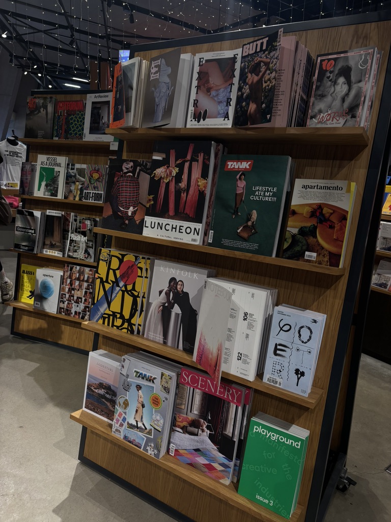
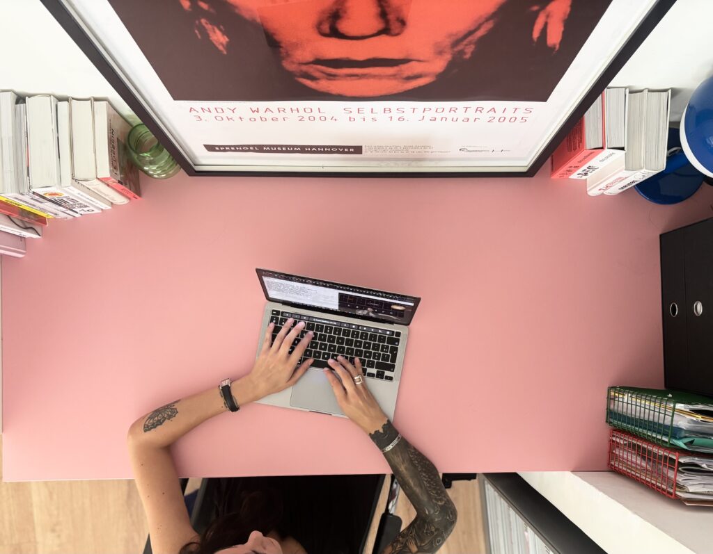
I think that's also why I always stay far too long in that section. I might buy a book solely for its cover, a typeface or a layout, and then pull it off the shelf months later because a detail comes back to me. I operate a lot like that: I keep images, colours and compositions in my head without necessarily knowing right away what I'll do with them.
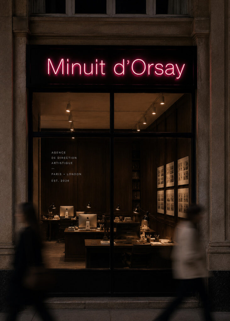
Ultimately, that's also why I created Minuit d’Orsay I love understanding how images, words and a few design choices can give a project real personality. And if you are currently imagining yours, you can talk to me about it here.

0 commentaires
Be the first to leave a comment.
Comments are closed on this post.