If you are interested in graphic design in London, Fraser Muggeridge is a name you will come across quickly. His studio has been part of the city’s design landscape since the early 2000s, working across publishing, cultural institutions, music, artists’ books, posters, identities and websites.
What interests me is that you cannot sum up his style in three neat words. It comes through in the way he handles text, letterforms, scale, paper and production. The projects can look completely different from one another and still feel connected. That, to me, is where a real signature begins.
A lasting presence in London graphic design
Fraser Muggeridge Studio was founded in London in 2001. It has since worked mainly with artists, writers, galleries, publishers and cultural institutions. That closeness to art and publishing explains a lot about the way each project is approached.
The work is never confined to a logo or a single layout. It moves between exhibition catalogues, posters, books, identities, record sleeves, film titles and websites. The format changes, but the attention given to the content does not.
He also founded Typography Summer School, a programme held in London and New York. Teaching sits alongside the studio’s commissioned work rather than feeling like a separate part of his practice.
When typography becomes the main material
Typography is, very simply, the way letters and typefaces are chosen and used. In Fraser Muggeridge’s work, it is not something added at the end to decorate an image. It can be the entire starting point.
One word might fill a page. A letter can become almost abstract. A deliberate shift in scale can give a poster all of its rhythm. The result often looks simple, but it is never neutral.
His work on A Bath Full of Ecstasy for Hot Chip is a good example. The identity began with lettering found in an old book and developed through a printing process that produced a huge range of colour variations. It feels spontaneous, although a great deal of research sits behind it.
Books, archives and the history of graphic design
Fraser Muggeridge looks closely at design history, printing techniques, archives and ordinary printed objects—not only the famous references already circulating everywhere.
That is part of what gives the work its depth. An old letterform, a monogram, a printing error or a detail found in a book can become the beginning of something contemporary without ever feeling nostalgic.
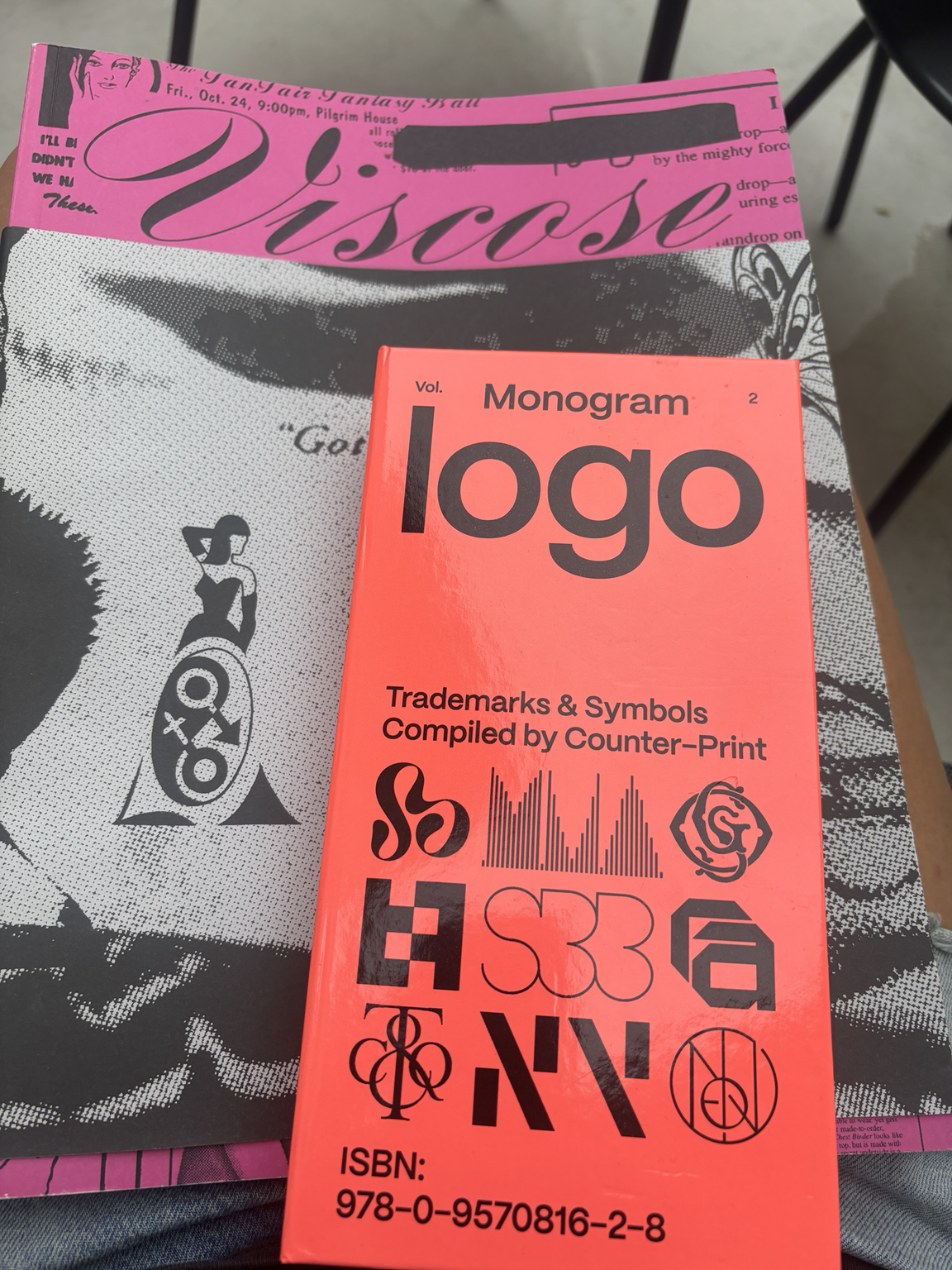
I discovered Monogram Logothrough one of his recommendations, and I wrote about it in my favourite graphic design books. Books like this are a reminder that graphic design has a much bigger history than the same selection of images endlessly repeated on Instagram and Pinterest.
Making room for accidents and imperfection
The studio’s work is not always polished in the conventional sense. A composition might sit deliberately off-centre, a letter may take up too much room, or a printing method may create variations that no one rushes to correct.
The project crayonograph captures this approach perfectly. Instead of producing a traditional monograph, years of studio projects were redrawn in pencil and collected in a book. Existing work is transformed simply by changing how it is reproduced.
It is a long way from perfectly smooth, controlled graphic design. The precision is still there, but there is room for the material itself—and for accidents—to shape the result.
The same thinking carries onto the web
Fraser Muggeridge Studio also designs websites. I find that especially interesting because moving from paper to screen can easily make a studio’s work feel much safer.
Here, the websites remain led by the text, imagery and material they need to present. They never feel like one standard studio template. Each project keeps its own pace while retaining the same care for proportion, letterforms and structure.
A recognisable signature without repeating the same project
Fraser Muggeridge’s work is recognisable, and that is precisely why it has a signature.
Being recognisable does not mean repeating the same typeface, colour or layout every time. A signature can come from the way someone composes a page, chooses references, handles language or notices details.
That is how a studio can have a strong presence while still allowing every commission to exist on its own terms.
Why Fraser Muggeridge matters in London
His place in London graphic design comes from more than longevity. It is his ability to connect publishing, culture, typography, teaching, print and the web. Rather than following whatever London aesthetic happens to be fashionable, he contributes to a broader graphic culture shaped by books, institutions, artists and British design history.
If you are curious about contemporary graphic design in London, his work is a brilliant place to begin. Not because it should be copied, but because it shows how a practice can become unmistakable over time without turning into a repeated formula.
















0 commentaires
Be the first to leave a comment.
Comments are closed on this post.