Hello everyone!
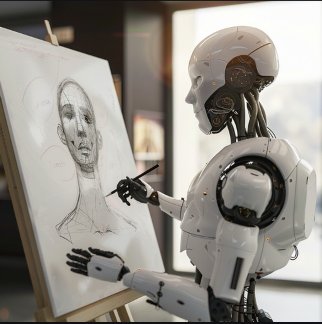
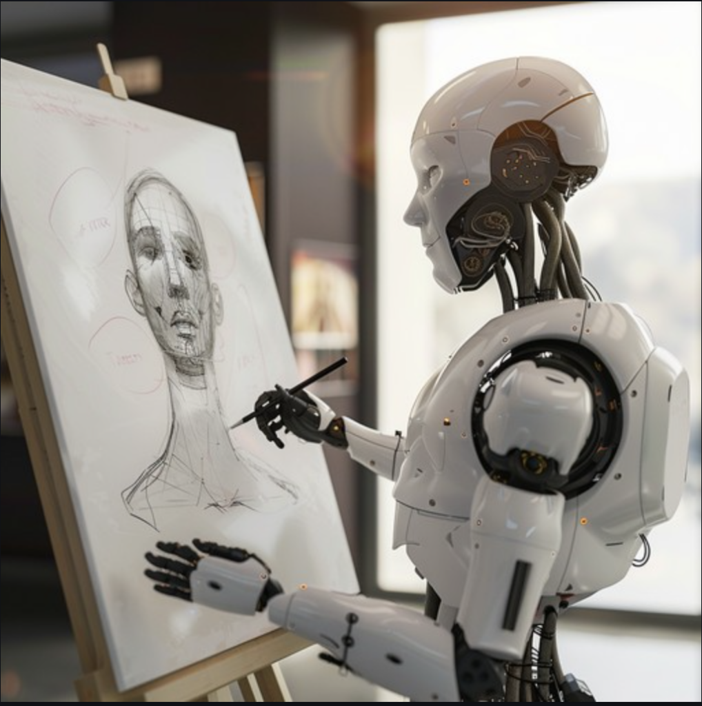
A few days ago, I came across information that immediately caught my attention: the City of Sète has decided to no longer print or broadcast on its municipal media the association posters that are entirely generated by artificial intelligence.
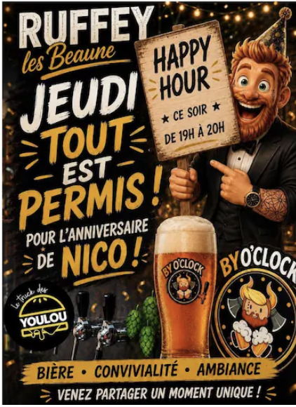
I thought to myself: finally, someone is putting words to this impression that I have more and more often. You know, those posters that you look at for two seconds before thinking: "Well, that's AI." Not because they're necessarily bad, but because they all end up having a little family resemblance.
What the City of Sète has really decided
The nuance is important: Sète has not banned artificial intelligence throughout the city. The city hall no longer wishes to contribute to the dissemination of visuals entirely generated by AI. These posters will therefore no longer be printed by the municipality or shared on its own networks. Associations remain free to communicate in other ways and partial use of the tool is not excluded.
I find this precision rather clever. It’s not about pretending that AI doesn’t exist, nor about deciding that everything it produces is bad. It’s mainly about giving a little more choice, perspective, and responsibility to what we decide to show.
When all the images start to look alike
In the report I saw, the mayor of Sète explained that after a while, you couldn’t even really tell if the posters represented Provence, the Basque Country or another region. And that’s exactly the problem: an image can be spectacular, colorful and very well executed while telling absolutely nothing about the place it is supposed to represent.
I notice it in restaurant posters, local events, menus, or Instagram posts too. There are often a lot of effects, a lot of light, very smooth characters, and colors that immediately catch the eye. But once the first effect is gone, there’s sometimes not much left. The place could be in Sète, Paris, London, or anywhere else.
As a graphic designer, that’s definitely something that keeps me busy. When I create the visual identity of a restaurant or from a hotel, I start by looking at the place, the people, the light, the objects that are already there and the way the place really lives. A poster or a website should not cover all of that with a trendy image. It should instead allow us to see it better.
However, I am not against AI.
It would be quite hypocritical of me to claim that I never use artificial intelligence or that it doesn’t interest me. I find these tools fascinating. They can help to find a lead, test an idea, unlock a moment when we’re stuck, or save time on some tasks that are frankly not very exciting.
But a proposal obtained in a few seconds is not necessarily a finished result. This is where I think that people sometimes confuse the speed of production with the quality of a creation. The tool can produce something. It does not always know why that thing should exist, who it is talking to, or what it is supposed to tell.
And then there’s the need to know how to remove it. Re-using a typeface, softening a color, moving an element, deleting an element that doesn’t serve a purpose… All of this work is less daunting than creating a one-off design, but it’s often what makes an advertisement clear, personal, and recognizable.
A matter of perspective, not just a matter of tool
I developed the more professional part of this reflection in my article published in the journal Minuit d’Orsay. I talk more about composition, hierarchy, artistic direction, and what happens when you print the first draft without really looking at it.
If you have a restaurant, a hotel, a brand or an independent venue and you are looking for a visual identity or a site that truly tells the story of your project, I can also tell you about it. Why I created Minuit d’Orsay. And if you already have an idea in mind, you can Write to me directly. I like starting from a place, a story, and real details to build an image that doesn’t resemble everyone else’s.
On this blog, I wanted to talk mainly about how these images change our daily lives. A city is also made up of its facades, its posters, its signs, its programs, and all the little things we encounter without necessarily thinking about them. When everything adopts the same aesthetic, it gradually loses part of its face.
The Sète decision is obviously not going to solve all the questions posed by AI-generated images on its own. But it at least forces you to pause for a few minutes before pressing "print". And frankly, that's not too bad.
And do you recognize the AI-generated posters immediately? Does it bother you or do you think that we will simply get used to it? I would be very interested to read your opinion.
To go further: The report on the Sète decision.
0 commentaires
Be the first to leave a comment.